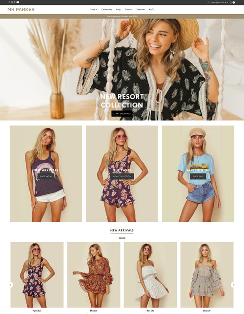
Drop - Product pages
Product pages include a number of setup options that allow you to shape and control the behavior and appearance of content.
The product page in the Drop Shopify theme is made up of multiple sections to maximize the impact of product content and to make for easier control and setup for merchants. Sections and blocks built into the product template include:
Coming soon
A section that comes to life when used by a product containing a date metafield built for countdown / coming soon products. Countdown setup instructions
This area allows you to build content and offer information to merchants on forthcoming products and provide a safe, no purchase landing page so that you can gather SEO, build hype and bring in inbound traffic building momentum for your upcoming product drops and releases.
Coming soon settings:
-
Image gallery
Enable click to enlarge on product images -
Gallery size
Set the size of the gallery in proportion to other on page content
Coming soon blocks:
-
Countdown
Utilize product metafields and add a future date
See setup guide -
Title
Show and control the position of the product title. -
Description
Show and control the position of the product description. -
Notify button
Add a notify me when available button for customers to add their email address. -
Accordion content
Add an expanding / collapsing accordion with rich text or content from an existing page. -
Text
Add a single line of text -
Text popup
Add content to an on page modal as Rich text, meta field content or content from an existing page.
Purchase form
The purchase form contains options for customers to be able to make purchase, make sure to not hide any required blocks like Variants or Add to cart buttons.
Purchase form settings:
-
Show on coming soon products
Toggle visibility of this section on products that can not be purchased yet. -
Thumbnail position
Select the position of product media thumbnails. -
Enable click to enlarge
Allow images to be enlarged when clicked. -
Enable video looping
Allow videos (where present) to loop continuously.
Purchase form blocks:
-
Title
Set position and visibility of the product title. -
Payment terms
If payment terms like ShopPay are enabled in your store, toggle its visibility and set the position in relation to other content. -
Variants
Set position and visibility of product variants. -
Prices
Set position and visibility of product prices. -
Buttons
Set position and visibility of add to cart + dynamic checkout buttons.
Include visibility toggle for quantity selection. -
Text popup
Add a popup modal to the page with text, metafield or existing page content. -
Text with icon
Set the position and visibility of text with pre-designed or upload-able icons. -
Upsell
Select an additional product that will be featured on your product pages to encourage more sales. -
Line item property
Add text input properties that allow customers to personalize products. -
Pickup availability
Set the position and visibility of pickup locations for stores that allow local pickup. -
Description
Set the position and visibility of the product description. -
Social sharing
Set visibility and position of Facebook, Twitter and Pinterest social sharing links to promote and build inbound links to your products.
Description
An additional product description is added to the product pages for stores that prefer to show a large, wide description below the images and product form content.
Description blocks:
-
Show title
Toggle visibility of the product title in this section. -
Heading size
Override the global theme font sizes for this section. -
Text size
Override the global theme font sizes for this section. -
Alignment
Set text alignment for this section. -
Content width
Choose a full size or smaller compressed width. -
Color scheme
Choose a pre-defined color scheme for content.
Product Navigation
The product navigation section allows you to add links to the current collection associated with this product with links to the next and previous product for faster browsing between items.
Details list
The details list allows you to embelish on content shown for products and allows you to add more content not used in other sections if you would like to stretch out your product content across multiple sections.
Details list settings:
-
Image
Select a global image shared by all products or use a metafield named: "myfields_details_image" for a product specific image on each item. -
Color scheme
Choose a pre-configured color scheme for this section.
Details list blocks:
-
Text
Add a single global text line or use a metafield to add product specific content. -
Richtext
Add global multi-line text or use a product metafield for product specific content.
-
Type
Set the position and visibility of the product type. -
Vendor
Set the position and visibility of the product vendor. -
Collection
Set the position and visibility of a link to the collection associated with the product. -
Inventory
Show the count of the current product inventory. -
SKU
Set the position and visibility of the product SKU -
Weight
Set the position and visibility of the product Weight.
Tip: Open Theme settings > Products to view more product display options which include showing swatches or dropdowns for variants, displaying the SKU, quantity and dynamic checkout buttons.
Note that these theme settings are shared with any Featured product sections that you choose to display in your store.


