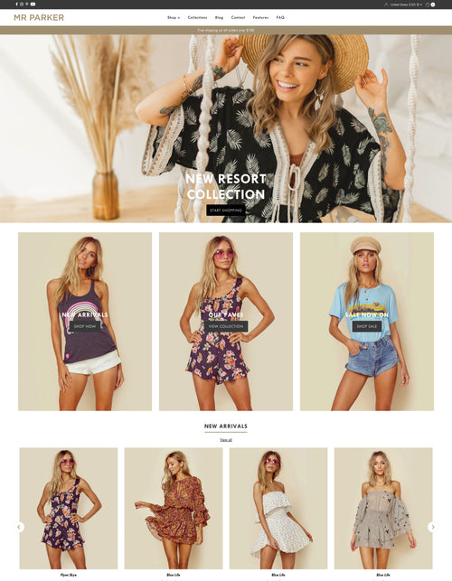
Mr Parker - Theme settings
Theme settings exist to control the appearance of content and set the base style for your store. Where sections might have their own individual settings, theme settings are here to cover repeated or static content.
Favicon
Upload a favicon image which will be displayed in the Browser tab and bookmark toolbar.
Colors
Control the color scheme for different areas of your store which include:
- Announcement bar
- Header
- Navigation
- General text and content
- Section headings
- Banner captions
- Buttons
- Carousel direction arrows
- Product variant swatches
- Footer
Typography
Choose the font styles for your store content
- Main font + size
- Navigation font + size
- Heading font + size
- Section titles & subheading font + sizes
Global
Set your preferences for content across your store
-
Ultra wide width
Set the site content to a wider view on ultra large screens -
Scroll animation
Set the scroll animation for content as you scroll down the page -
Rounded button corners
Toggle between rounded corners or sharp edges -
Section heading styles
Select different looks for section headings to match your aesthetic -
Keyboard focus & borders
Adds greater visibility of keyboard selected content for users with disability -
Search
Toggle product suggestions and between only showing products in results
Collection lists
Set the visible options for collections when viewed within sections or the All collections page.
-
Collection image ratio
Help align images of different sizes to keep a perfectly aligned grid -
Collection titles
Choose where your collection titles will appear -
Show collection product count
Toggle visibility of collection product counts -
Add overlay to image
Toggle an overlay over collection images
Product grid
Set the visible options for products when viewed in a grid (collection pages, search, featured collection sections)
-
Product image ratio
Help align images of different sizes to keep a perfectly aligned grid -
On image hover
Choose options for when hovering which include:
Show secondary image: Display an alternate product image
Show product info: Hide product titles and prices revealing them only on hover
Do nothing: For no change when hovering over image -
Sale, New & Sold out position
Choose positing for the product icons
Product details:
-
Text alignment
Align product titles and pricing left or center -
Bold prices
Allow prices to stand out on the page -
Show vendor
Displays the product vendor -
Border around products
Frame your items to help with definition -
Show color variants
Shows color swatches on grid -
Show size variants
Shows size swatches on grid
Quick shopping options:
-
Show quick add to cart
Button to quickly add the product to cart (products with more than 1 option cannot be added to cart without selecting option first) -
Enable quick view
Adds a popup product modal for expedited shopping
Product pages
Choose available options which are available for a single product when viewed in either a product page or featured product section.
-
Product variant display
Choose to display swatch buttons or a dropdown menu for selecting variants -
Show color swatches
Toggles color swatch visibility as color specific icons or the text name of the color ( Red, Blue, White etc.. ) -
Swatch option name
Add comma separated variant option titles like color, colour, colore to dictate where color swatches should be used -
Color swatch shape
Choose Circle, Square or Rectangular color swatches -
Color swatch style
Custom images, allow you to upload color specific images ( see guide )
Zoomed in variant images ( shows the variant image assigned to the color )
Default color ( Uses the HTML color chart to show a solid color ) -
Show dynamic checkout button
Toggles visibility of quick checkout buttons -
When adding to the cart
Select cart behavior when adding items by opening the cart or remaining on the current page.
Quickview product settings:
-
Show vendor
Display product vendor / brand -
Show variant SKU
Displays the SKU for currently selected variant -
Show quantity selector
Display a quantity input allowing customers to increment their quantity.
Customer Accounts:
Settings used for the Classical style customer accounts
-
Show return/exchange info
Toggle showing a link to your Return policy in the customer account page -
Return/exchange info
Select a page for the link to go to
Cart
There are several options available for controlling the look and feel of your shopping cart, we recommend trying them all to see your preference.
-
Cart type: Choose the behavior when clicking the Cart button
Page only: Go to the cart page
Drawer cart: Open the cart in a side drawer
Modal cart: Open the cart in a modal window
Page only - no automatic updates: Go to the cart page but require a refresh when updating, this option exists as we know some apps do not support Ajax or carts that auto update. Use this if your app experiences those issues and your app developer is not helping.
- Cart link icon: Choose between using a Cart or Bag icon
- Show tax note: Toggle a setting that shows a note that tax is calculated at checkout
- Show shipping note: Toggle a setting that shows a note that shipping is calculated at checkout
- Show cart note box: Toggle a setting that allows the customer to leave a note on their order
Shipping Calculator:
- Show shipping estimator: Show a shipping calculator that will estimate how much shipping will be. Only available on cart page
- Default country selection: Place to enter the default Country that will show in Shipping Calculator when opened
Free Shipping Countdown:
- Show free shipping countdown: Toggle setting to turn on and off. Used to show how much customer is away from free shipping. Only works in store's default currency
- What price qualifies for free shipping?: Place to enter the amount needed to get free shipping
- Free Shipping Countdown color options: Color pickers to change background color of the banner and the text color
Social media
Add links to your chosen social media channels
Custom CSS
Add custom CSS styling that will apply to your whole site here if you are familiar with coding.


