Fashionopolism - Sections
Fashionopolism includes a number of theme sections which can be used across your store repeatedly to build compelling visual experiences and maximize the display of your content.
Fashionopolism sections
- Accordion
- Background video
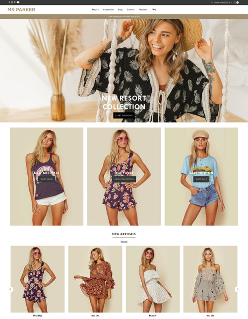
- Banner header*
- Before / After image slider
- Breadcrumbs*
- Collection carousel
- Collection list
- Contact form
- Countdown
- Custom Liquid
- Editorial columns
- Featured blog
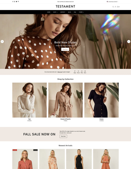
- Featured collection
- Filter and search
- Featured product
- Image gallery
- Image with text overlay
- Image with text
- Linklist
- Logo list
- Map
- Newsletter
- Promotional banner*
- Promotion bar
- Related products*
- Rich text
- Sale banner
- Scrolling text
- Section heading
- Shop the look
- Slideshow
- Story
- Tabbed collections
- Testimonials
- Text banner
- Text with icons
- Video
Items marked with * are not available for selection on the home page.
The theme also includes two Section groups - Header and Footer - where you can add Sections that will show globally across your shop without the need to add them to every templates. The specific Sections are as follows.
Header sections
Footer sections
- Contact form
- Countdown
- Custom Liquid
- Filter and search
- Linklist
- Logo list
- Newsletter
- Promotional banner
- Promotion bar
- Rich text
- Sale banner
- Section heading
- Text with icons
Accordion
A text section that allows collapsible content panes, often associate with FAQ or questions and answers. Accordions are great for pages with large bodies of text content.

Banner header
A page header allowing for a full screen width image.
This section is available for use on the Blog, Article, Page, Cart and Customer accounts. The Collection page has a similar section called Collection header.

Background video
Add an autoplaying background video which brings animation to your store captivating your customers attention and increasing the time on page.
Before / After image slider
Stack 2 large images with a draggable slider which reveals more or less of each image. Great for a before and after image comparison or for showcasing 2 different colors of a product.

Breadcrumbs
A text section which shows a navigation trail normally associated with products and a trail back to collections. For example when viewing a product page having opened the product from within a collection your breadcrumb trail will show:
Home > Collection title > Product title

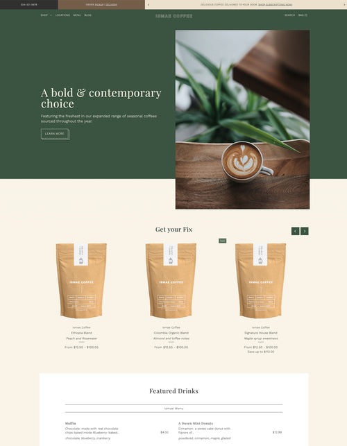
Collection carousel
Merchandise your store with a Collection carousel section which shows an image with text alongside a carousel of products from a selected collection.

Collection list
A collection list allows you to select different collections from within your store and display them in any page of your store for quick access. Control the number of collections shown in the grid and the appearance with some optional image shapes.

Contact form
Add a contact form to any page of your store allowing customers easy access to questions and answers. Edit the fields by adding/removing blocks.

Countdown
Add urgency to a promotion or event in your store with a countdown timer

Custom liquid
Add app snippets or other Liquid code to create advanced customizations.
Editorial columns
Editorial columns show a grid of images above text for a strong column view, perfect for introductions to pages or additional product and collection details that benefit from additional organized content.

Featured blog
Select a blog from your store and show recent posts on any page, formatting controls allow optional content and layouts.

Featured collection
Showcase a collection of products in a grid or carousel, ideal for sale, new arrivals or adding products to any area of your store.

Featured product
Add a specific product to any page within your store, great if you have a promotional product or subscription / gift offering.

Filter and search
Select multiple collections and assign which properties will be displayed when each is selected, creating a powerful search and filtering experience. This section offers fast access to products for stores that have a wide range of products
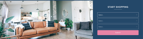
Image gallery
Add one full-width or a selection of images with optional text and links to your store to bring focus to products, collections or any other content. Control the width of each image to create different eye catching layouts.

Image with text overlay
Show a large full width image with an optional title and text overlay, if you have lifestyle imagery then this is a great place to add that. We do recommend not using images that contain text for this area due to its smaller size on mobile.

Image with text
Add a single or double up with 2 images alongside a title, text and button area with a colored background. Choose the size of your image area and its layout from left image or right image.

Linklist
Display a simple horizontal menu created in the Navigation section of your admin for quick access to additional content.
Logo list
Add a section of images that might be used to represent logos for an "as seen in" or list of brands that you carry, or use it to fake a social image feed.
Newsletter
Add a subscription area for your newsletter.

Promotion bar
Display a text announcement anywhere in your store to promote content or store hours, phone numbers or anything you would like to show.
Promotional banner
Show text announcements with a bold title announcing different store policies or promotions to alert your customers. Optionally, add an image background.
Rich text
Add a single block of text for a wider view or add columns of text which help to clearly define content or policies in your store, use as secondary description content for your products to show returns or delivery info or show a simple welcome message and store hours.

Related products
*Product page only. Hand pick a small selection of products using metafields to show additional products that are relative to the product page being viewed
Sale banner
Use multiple text blocks to create a large sale banner with controls for an eye catching call to action.

Scrolling text
Create a scrolling text banner made up of numerous text blocks. Include icons to capture your customers attention and bring focus to promotions and events.
Section heading
Break up content or bring focus to specific areas by inserting a section heading.
Shop the look
Pick multiple products that sit alongside a large image showcasing the products within that image.

Slideshow
The slideshow allows up to 5 slides with images and optional text to showcase lifestyle imagery and add calls to action driving customers to key areas of your store, optionally set to full width for ultra large images.

Story
Combine text, images and video to create a grid layout story leading customers across your page while showcasing different content.

Tabbed collections
Show multiple featured collections in a tabbed view offering customers fast access to products and collections in your store in a minimal space

Testimonials
Add customer testimonials to your store, which on desktop show in a neat grid for quick visibility converting to a carousel on mobile to maximize screen space.

Text banner
Use multiple rich text blocks to create a wide banner style info bar featuring different messages.

Text with icons
Show icons above or alongside text to illustrate content, offers, policies or trust statements.
Video
Set a featured video or an auto playing background video to any area of your store, add optional text overlay with a call to action button to move customers to specific products or promotions.


